

 THIS GUY!
Jan Tschihold was a master typographer and one of the most influential designers of the 20th century. Born April 2, 1902 in Leipzig, he was the son of a sign painter and lettering artist, which soon became fascinations to him.
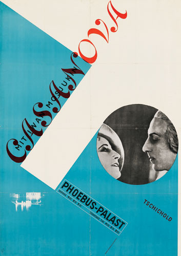
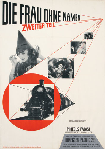
In 1923 Jan Tschichold visited the Bauhaus exhibition in Weimar where he was introduced to Modernist design and quickly joined the movement. Influenced by the new typography at Bauhaus , Jan Tschichold began to use serifless typefaces and designed simplified layouts. Rather than sticking to traditional fonts and symmetrical composition he began embracing sans-serif typefaces, geometric construction, and asymmetrical composition. His work, intended to represent the rationalism of the modern age, was functional, aesthetically satisfying, and designed for reproduction by machine-type composition and newer printing technology.
Tschihold was most famously known for publishing his 1928 book, Die neue Typographie (1928; The New Typography; A Handbook for Modern Designers), which expounded the principles and functional uses of Modernist typography to printers, type compositors, and designers. He was arrested in 1933 by the Nazis for being a “cultural Bolshevik,” and fled to Switzerland and worked as a book designer. While away, his Typographische Gestaltung (1935; Asymmetric Typography) and other works were first published in Basel. From 1947 to 1949 Tschichold was typographic designer for Penguin Books in London. Here he designed more than 500 title pages and specified the future typography for the Penguin series of paperbacks.
Among the later books by Tschichold are Meisterbuch der Schrift (1966; Treasury of Alphabets and Lettering) and the posthumously published Ausgewählte Aufsätze über Fragen der Gestalt des Buches und der Typographie (1975; The Form of the Book: Essays on the Morality of Good Design).
Although designing typefaces was not Tschichold principal activity, he was known for the following:
- Transit (1931)
- Saskia (1931/1932)
- Zeus (1931)
- Sabon(1966/1967) -examples
it looks a little like this..

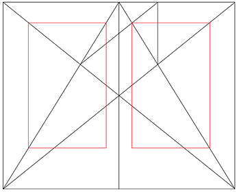
Tschichold set up a formulaic grid system which he thought to be proper layout proportion. He endorsed this guideline as a tool to create clear, concise compositions every time


No comments:
Post a Comment