
01 - absolute measurement: measurements of fixed value that cannot be altered.
02 - relative measurement: measurements, such as character spacing, that are linked to type size; their relationships are defined by a series of relative measurements.
03 – point: the unit of absolute measurement used to measure the type size of a font. there are typically 72 points in an inch
04 – pica: a unit of measurement that is equal to 12 points (1/6”)
05 - em (and em dash): em is a common unit in typography. It is typically the width of the uppercase “M” in the current face and point size. it is more properly defined as simply the current point size. em dash is a dash the length of an em is used to indicate a break in a sentence; used in text to separate a parenthetical note as an alternate to parenthesis.
06 - en (and en dash): en is traditionally defined as the width of the uppercase “N” in
the current face and the current point size. it is more properly defined as half the width of an em. the length of an en dash en is used to indicate a range of values.
07 – legibility: The ease with which text is read in ordinary, continuous reading, usually gauged by reading speed and error rate. Also, Readability.
08 – rag:
09 - type alignments: advantages and/or disadvantages
flush left: Setting lines of text so that any extra space is on the right, and the text is against the left margin. Also called ragged right.
Advantage: easy to read
Disadvantage: the asymmetrical ragged right end that is created.
flush right: Setting lines of text so that any extra space is on the left,
and the text is against the right margin>
Advantage: easy to read
Disadvantage: the asymmetrical ragged right end that is created.
Centered: text placed at an equal distance from the left and right margins.
headlines are often centered.
centered text is used to distribute residual space on the line equally
to the
right and left.
Advantage: great for headlines
Disadvantage: the asymmetrical ragged right end that is created
And makes text hard to read at times.
Justified: justification involves the use of three values for type setting: minimum, maximum and optimum values.
Advantage: creates balanced formal columns of text, providing visual symmetry and clean margins
Disadvantage:.
10 - word spacing: traditionally has been based upon a space equivalent to the body width of a lower case “i”. the space created can be adjusted to fit a certain design which helps the legibility become clearer when words are closer together.
11 – rivers: visually unattractive gaps appearing to run down a paragraph of text formed by white spaces between words lining up over several lines. They can occur with any spacing, though they are most noticeable with justified text
12 – indent: attribute of a text line that creates a readable entrance to a paragraph
13 – leading: specifying the depth of space between lines (sometimes known as the pitch or line feed). it is used to achieve a balanced text block and usually has a larger point size than the text it is associated with.
14 – kerning: the adjustment of space between pairs of letters to make them more visually appealing. It is normally applied to individual letter pairs in headlines or other large type
15 – tracking: also known as letterspacing, is done by adjusting the overall space between letters, rather than the space between two characters.
16 – weight: Heaviness or blackness of letters. Numerically, the ratio of the widths of vertical strokes to the x-height
17 – scale: increase or decrease in point size
18 - typographic variation: visually clarifies the reader specific kinds of emphasis and prioritization, and establises the distinction between different kinds of content.
19 – orphan: A header or the first line of a paragraph that appear as the last line on a page.
20 – widow: The last line of a paragraph that appears at the top of a page.
Monday, August 31, 2009
Wednesday, August 26, 2009
Josef Müller-Brockmann
Josef Müller-Brockmann was born in Rapperswil, Switzerland in 1914 and studied architecture, design and history of art at the University of Zurich and at the city's Kunstegewerbeschule (the school of arts and crafts). He led the international typographic style, also Swiss design, which was characterized by the sans serif type face and precisely aligned layouts and reductive style.
In 1936 he opened his Zurich studio where he specialized in graphic and exibition design and photography. He then went on to produce concert posters. His 1951 series of concert posters were a definitive statement of his style. Very geometric, unemotional, and abstracted. And more than 30 years after he opened his studio, he founded "New Graphic Design," which spread the principals of the Swiss design ethic internationally. He also authored the books "History of Visual Communications" and "History of the Poster".


In 1936 he opened his Zurich studio where he specialized in graphic and exibition design and photography. He then went on to produce concert posters. His 1951 series of concert posters were a definitive statement of his style. Very geometric, unemotional, and abstracted. And more than 30 years after he opened his studio, he founded "New Graphic Design," which spread the principals of the Swiss design ethic internationally. He also authored the books "History of Visual Communications" and "History of the Poster".
Jan Tschichold is...


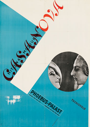
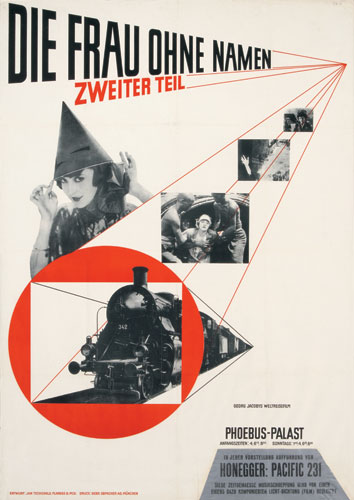
 THIS GUY!
Jan Tschihold was a master typographer and one of the most influential designers of the 20th century. Born April 2, 1902 in Leipzig, he was the son of a sign painter and lettering artist, which soon became fascinations to him.
In 1923 Jan Tschichold visited the Bauhaus exhibition in Weimar where he was introduced to Modernist design and quickly joined the movement. Influenced by the new typography at Bauhaus , Jan Tschichold began to use serifless typefaces and designed simplified layouts. Rather than sticking to traditional fonts and symmetrical composition he began embracing sans-serif typefaces, geometric construction, and asymmetrical composition. His work, intended to represent the rationalism of the modern age, was functional, aesthetically satisfying, and designed for reproduction by machine-type composition and newer printing technology.
Tschihold was most famously known for publishing his 1928 book, Die neue Typographie (1928; The New Typography; A Handbook for Modern Designers), which expounded the principles and functional uses of Modernist typography to printers, type compositors, and designers. He was arrested in 1933 by the Nazis for being a “cultural Bolshevik,” and fled to Switzerland and worked as a book designer. While away, his Typographische Gestaltung (1935; Asymmetric Typography) and other works were first published in Basel. From 1947 to 1949 Tschichold was typographic designer for Penguin Books in London. Here he designed more than 500 title pages and specified the future typography for the Penguin series of paperbacks.
Among the later books by Tschichold are Meisterbuch der Schrift (1966; Treasury of Alphabets and Lettering) and the posthumously published Ausgewählte Aufsätze über Fragen der Gestalt des Buches und der Typographie (1975; The Form of the Book: Essays on the Morality of Good Design).
Although designing typefaces was not Tschichold principal activity, he was known for the following:
- Transit (1931)
- Saskia (1931/1932)
- Zeus (1931)
- Sabon(1966/1967) -examples
it looks a little like this..
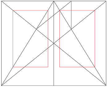
Tschichold set up a formulaic grid system which he thought to be proper layout proportion. He endorsed this guideline as a tool to create clear, concise compositions every time
Terms and Defintions
Grid, simply defined is:
A modular grid looks something like
It has consistent horizontal and vertical divisions from top to bottom and left to right, respectively, which govern the placement and cropping of text and pictures
DESIGNERS use modular grids for control and structure. By using modular grids, designers are able to arrange and manipulate text and images in many different ways within the structure of the grid, experimenting with the alignment of text and images and various texts and font sizes, in an easy and structured manner
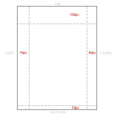
The margins are the areas around the workable area of a grid; the outside boundary. This area is to be left uncovered.
Columns are vertical blocks in a layout which are separated between margins.
Grid modules are the primary locations on your page where you will place text and images. They determine placement not necessarily size.
Flowlines are the lines in between characters
The gutter is the space between each module, including the space found in the fold of a book.
Hierarchy: is a way to express the relative importance of different text elements, images, or both by providing a visual guide to their organization; what the viewer should see 1st, 2nd and 3rd. A text hierarchy helps make a layout clear and easy to understand.To achieve clear hierarchy a designers should take into consideration placement, weight on type style, the size and scale, and the use of graphic elements.
A type family contains typefaces that have condensed and extended versions of display faces, commonly seen as distinct but related.
Type styles include the full set of standardized letter forms designed for reproduction through print.
A framework of crisscrossed or parallel bars; a grating or mesh.
A cooking surface of parallel metal bars; a gridiron. (not what we're really going for)
A pattern of regularly spaced horizontal and vertical lines forming squares on a map, a chart, an aerial photograph, or an optical device, used as a reference for locating points.A modular grid looks something like
DESIGNERS use modular grids for control and structure. By using modular grids, designers are able to arrange and manipulate text and images in many different ways within the structure of the grid, experimenting with the alignment of text and images and various texts and font sizes, in an easy and structured manner
The margins are the areas around the workable area of a grid; the outside boundary. This area is to be left uncovered.
Columns are vertical blocks in a layout which are separated between margins.
Grid modules are the primary locations on your page where you will place text and images. They determine placement not necessarily size.
Flowlines are the lines in between characters
The gutter is the space between each module, including the space found in the fold of a book.
Hierarchy: is a way to express the relative importance of different text elements, images, or both by providing a visual guide to their organization; what the viewer should see 1st, 2nd and 3rd. A text hierarchy helps make a layout clear and easy to understand.To achieve clear hierarchy a designers should take into consideration placement, weight on type style, the size and scale, and the use of graphic elements.
A type family contains typefaces that have condensed and extended versions of display faces, commonly seen as distinct but related.
Type styles include the full set of standardized letter forms designed for reproduction through print.
Subscribe to:
Posts (Atom)
